Sunday, April 29, 2012
Wreck This Journal
It's basically a book that tells you what to do and on each page is a different task. It will tell you to do things like rip pages out, scribble over the instructions, and stomp on it with your shoes.
I'm going to treat this like my daily practice. I will have the book with me at all times and I will try to complete it. One of my issues are organization and remembrance, whih probably explains my OCD and passion for photographing every moment of my life. But this book goes against both of my issues. That's why I'm excited to complete it.
I'm going to be documenting it.. Probably because I want to remember it. I'm a contradiction, I know.
Destroyingthejournal.tumblr.com
-ashleycoppolino
Saturday, April 28, 2012
I need to have a post on Andy Warhol.
The documentary clarified a lot that I didn't know about Warhol.
What I love about his work is that it's so distinct that you're able to tell right away that it's him. It also brings something that everyone has in their kitchen cabinet, like a can of Campbell's soup, and makes it art. Those are two of my three favorite things about art: distinct style and unintentional masterpieces.
The third thing I love about art is what we all know about me. I love photography.
I almost fell out of my chair when I realized that Andy Warhol is actually considered a photographer. His Marylin Monroe pieces were photographs. I don't know why it never hit me before. But when it hit me this week, it felt like a bus charged at my brain.
Andy Warhol has always been one of my favorite artists. In fact, one of my favorite quotes is one that he said: "The best thing about a picture is that it never changes, even when the people in it do." Only now did it just realize as I was typing his quote, it makes complete sense that he's a photographer.
The documentary was more of an eye-opener than I expected. I don't exactly know what I thought Warhol was before the film.
-ashleycoppolino
"i'd like my main course with a side salad, please."
The idea we constructed is basically a student gets bullied and loses it on everyone around him. He's thought to be crazy, and then he starts to believe it, but a girl convinces him that he's not crazy. It's underdeveloped, but that's what we have right now. We're writing the script currently, so I will update you on what goes on.
*****IF ANYONE WANTS TO ACT, LET ANDREW OR I KNOW! THANK YOU!*****
As for my side salad, with the end of the year approaching, we are in need of a STAC Montage. I decided that this would be a great thing to occupy my time. I actually love making slideshows, so this is perfect.
I'm going to take on two side salads (if I have the time). My idea is to take photographs and paint parts of the actual photo white. Then I will use my abstract designs to cover the photo. I love photography and I love dabbling in abstract designs, so I decided to mix the two together.
That's all for now. That's all for my senior year.
-ashleycoppolino
Tuesday, April 24, 2012
Independent (although not really) Project
Wednesday, April 18, 2012
Enneagram Test - 2012 Version
Sunday, April 1, 2012
Q3 Individual Written

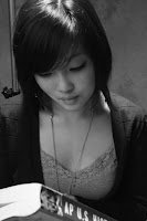
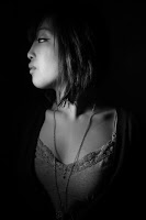
The first few days with the set-up, we focused mainly on lighting, but as we were getting used to it, we lost it along the way. We started to become preoccupied with personality. There’s a huge difference between a good photo and a bad photo. A good photo has good lighting and personality as two major components, as a bad photo lacks those two qualities. Below (photo on top), you could see how the lighting was off and basically how the photographer kept clicking the button without any thought of positioning the lights or making the background and subject look good. To the right you can see how the background is perfectly black, the light was positioned specifically for this shot, and you are still able to get a personality for the subject. For the shot shown on the bottom below, we placed the grid over the light, which is used to diffuse the light so it’s not as harsh. The diffuser gives the photograph a softer feel and reduces the chance of “washing/blowing out” the subject. We use the term “washing/blowing out” for when the light is too harsh and eliminates the skin tone making the photo white washed.
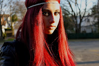
Michelle did the photoshopping on the final four photos. I don’t have a copy of photoshop, so my skills were limited when it came to editing. Photoshop can take practically any photo and transform it into a masterpiece. The top (shown below) is the before and the bottom (shown below) is the after. Michelle photoshopped the strands of hair that were in the way, she dyed the roots of the hair back to red, she removed all blemishes to the skin, she reconstructed the corner of the eye to delete a red shape, added the effect to make her skin look like pearl, and saturated the photo to enhance the overall shot.
